Expanding a Small Fairfax kitchen into Something Amazing
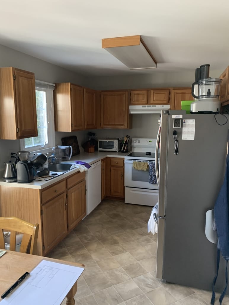
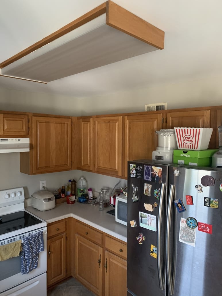
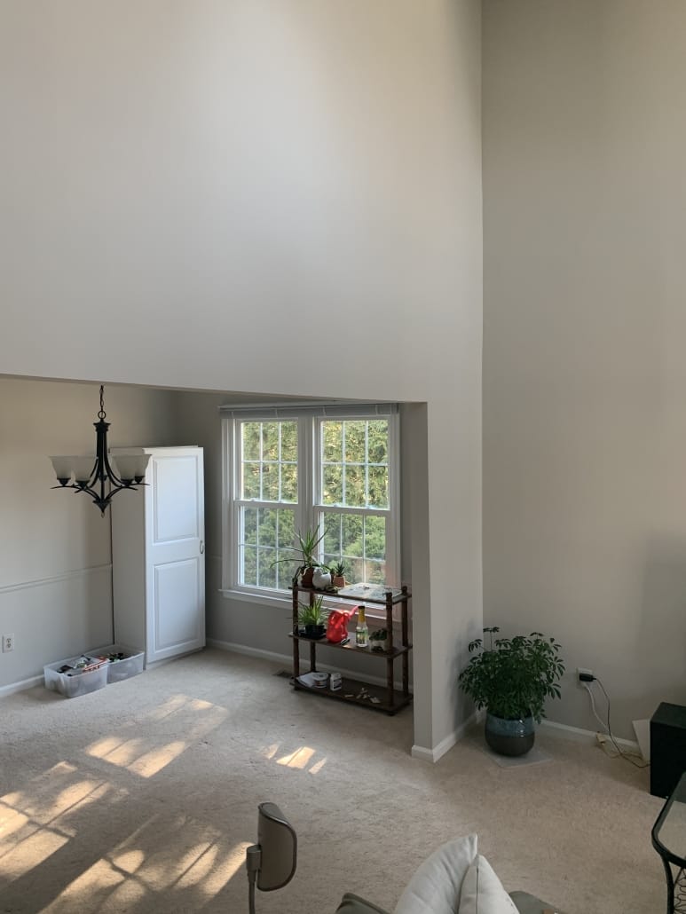
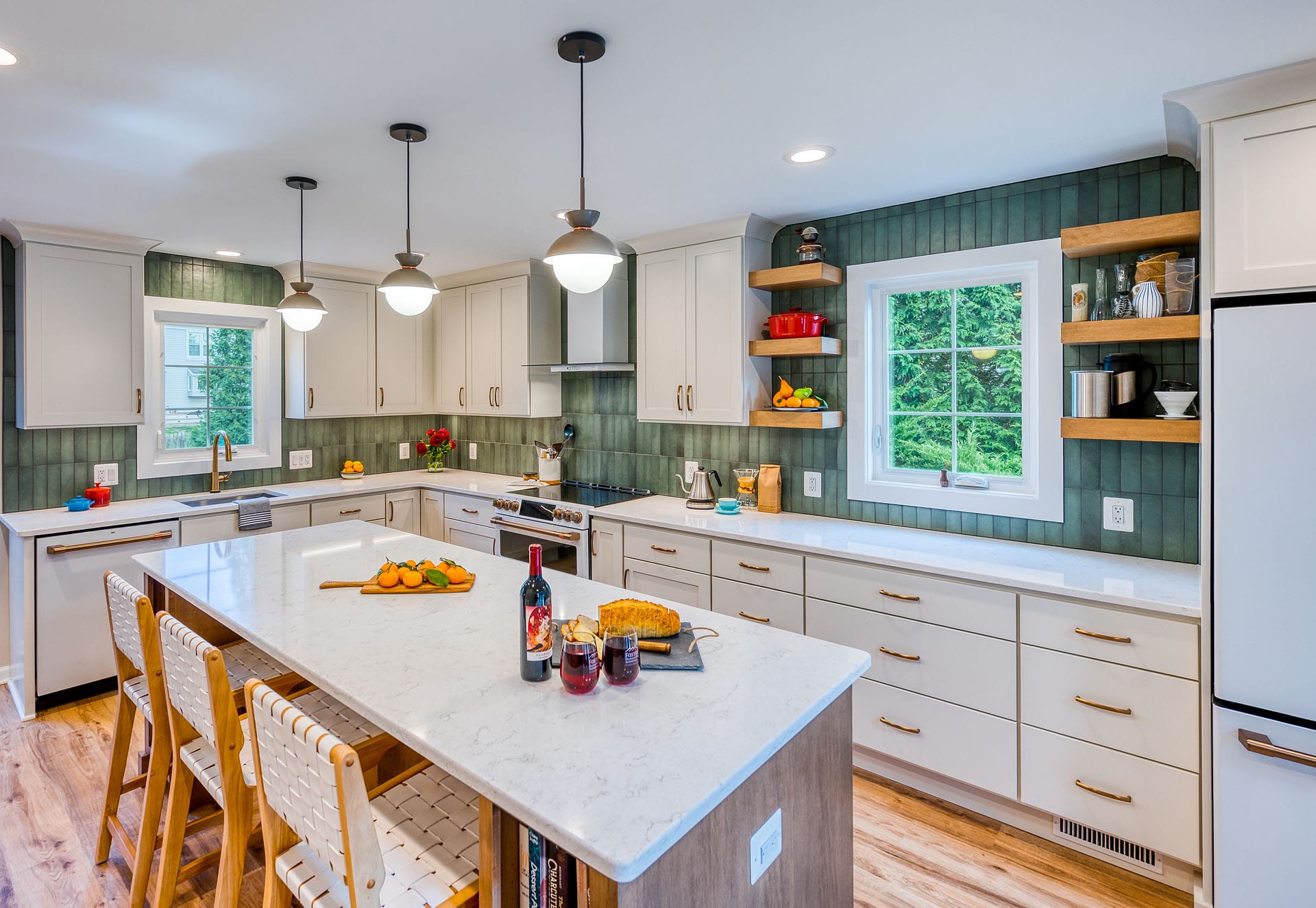
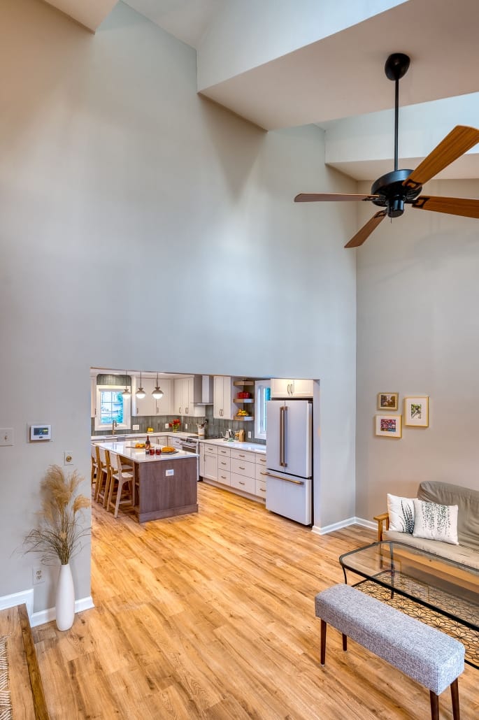
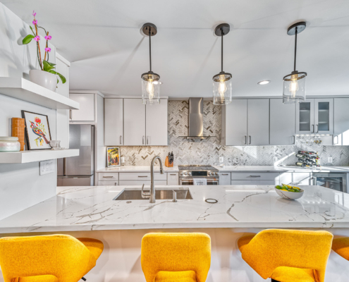
Rachel’s clients were interested in Expanding a Small Fairfax kitchen into something Amazing! They contacted Foster Remodeling Solutions with a request to update their cramped 1980s kitchen in Fairfax. This would involve removing a load bearing wall between the underutilized dining room and kitchen. The clients are a young couple who love to cook and entertain, with a transitional aesthetic—not traditional, but not super modern. The original kitchen was 9’x9’. Removing the dividing wall and changing out the low dining room window brought the useable kitchen space to 9’x18’. This allowed for plenty of space for additional perimeter cabinetry plus the addition of a large 8’x4’ island.
The Foster Process
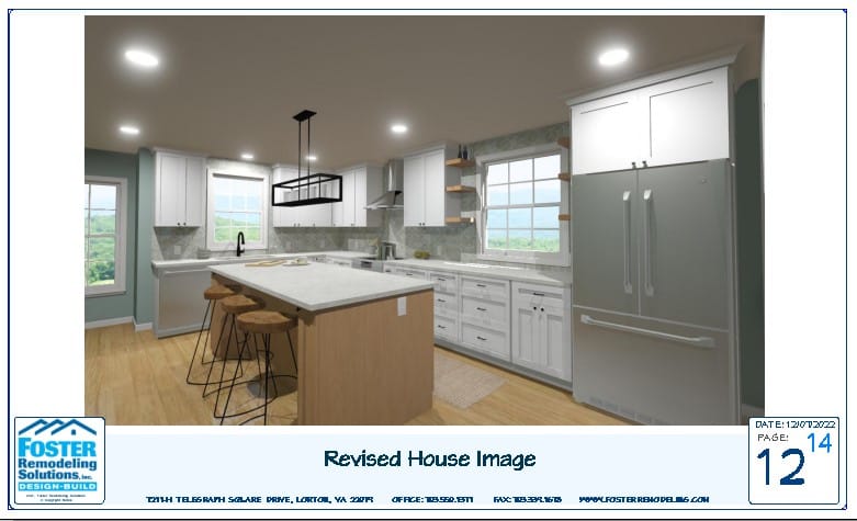
At Foster Remodeling Solutions, part of our process is to provide prospective clients with a presentation that utilizes 3D renderings. We base our presentation on the discussion we have during your initial appointment, where we discuss your vision for the space—but don’t worry—if you don’t quite have a vision yet, our designers are here to help. Rachel’s clients had a good idea of what they were looking for: expanded space, a large island that seated 3-4 people and white cabinetry. This slide from their presentation shows the concept that Rachel designed for them:
Selections
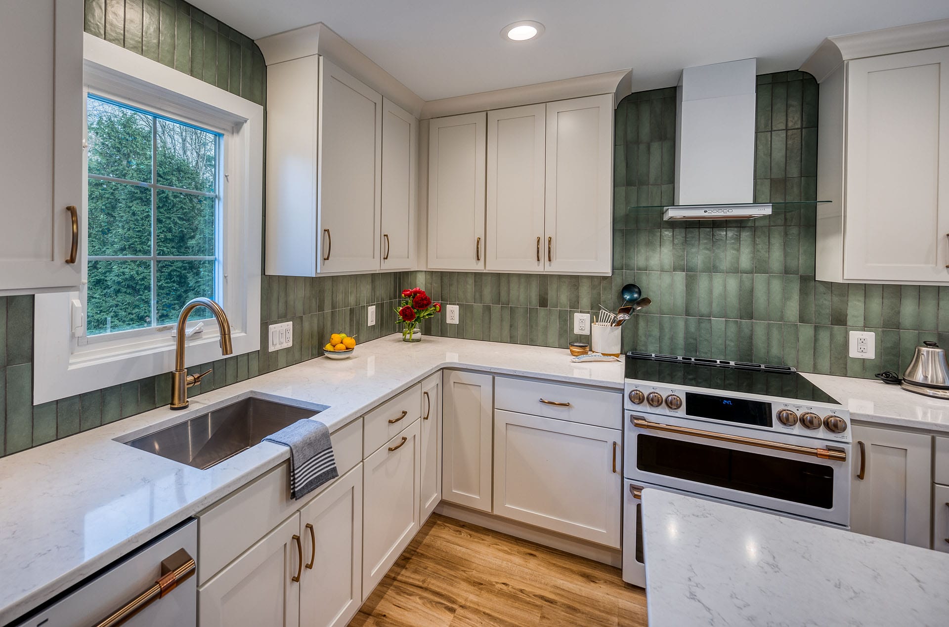
The clients loved the concept and entered into a design agreement with Foster Remodeling Solutions. The next part of the process involved a second set of measurements and commencement of material selections. The clients chose a traditional Shaker-style door by Crystal Cabinetry in “Alabaster”, a warm white finish. The island is also Crystal Cabinetry in maple with a medium finish. For a more transitional touch, the clients opted to go with all flat-panel drawers and a lot of them! Countertops are LG Viatera quartz in “Forte” with a polished finish. The floating shelves flanking the new dining room window repeat the warm island woodtone and provide open storage. White GE Café appliances add to the clean, transitional feel of this kitchen. And of course, the standout star of this design: the unique and variegated Bedrosian concrete subway tile set in a stacked horizontal pattern. Brushed bronze hardware and faucet round out this beautiful transitional space. Flooring was replaced throughout the first floor with a light oak luxury vinyl plank.
Rachel says “My clients were an absolute joy to work with—they had a vision for their kitchen, but needed a little help to really flesh it out. We spent a lot of time choosing a shade for the wood on the island—it had to meld with the lighter flooring. We had all of the materials here in the showroom with the exception of the backsplash tile. Once they saw the cabinet tones, the countertop, the flooring and the wood tone laid out together, they were set and felt really confident with our choices. As you can see, we didn’t deviate too much from the original slide and to me, that’s the best feeling—that I got so close based on my first concept!”.
The clients and their new baby, born shortly after construction ended, are enjoying their new larger, upgraded space!
